TC-TOOLS
The rebranding allowed us to combine long-standing tradition with contemporary trends.

About project
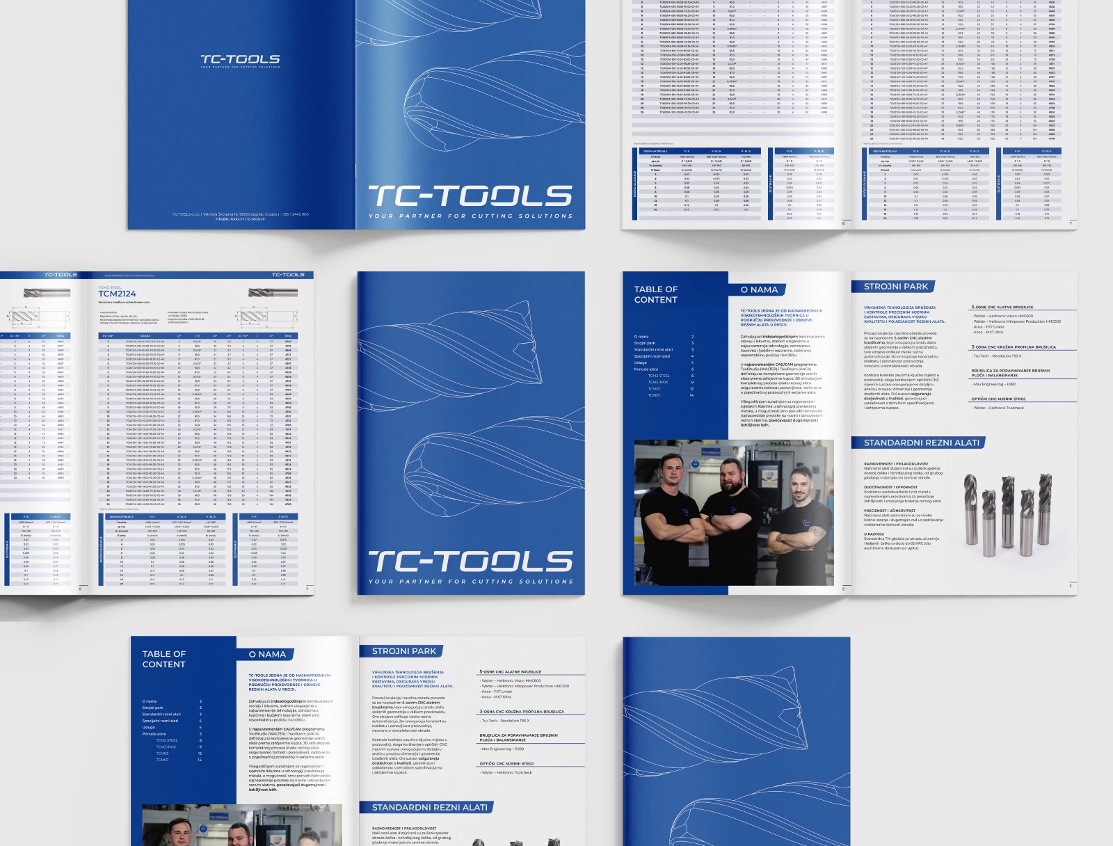
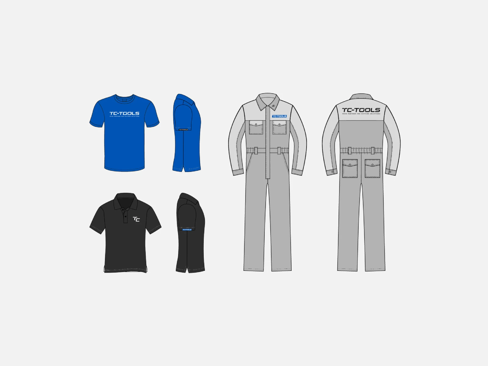
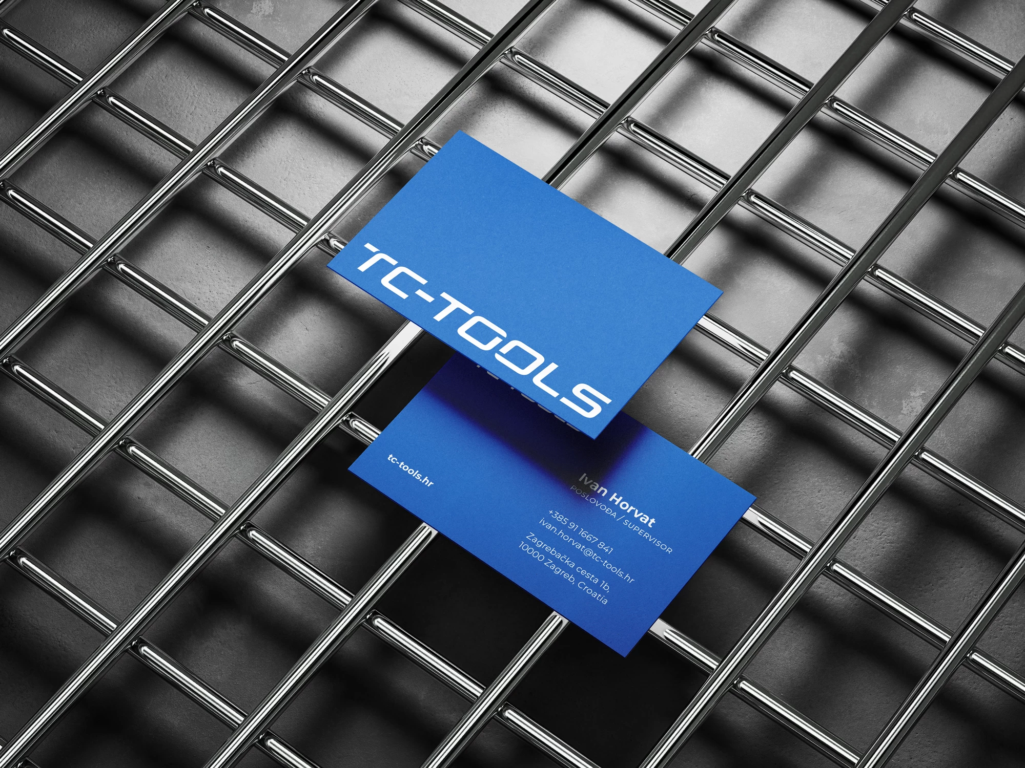
The goal of the rebranding was to refresh an outdated logo while retaining a recognisable visual element, and the challenge was to modernise and simplify the identity to clearly differentiate it from the parent company, Teh-Cut. Our guiding idea was to create a stronger, more refined identity that reflects the company's longstanding tradition and expertise in precision tool manufacturing.
Industry
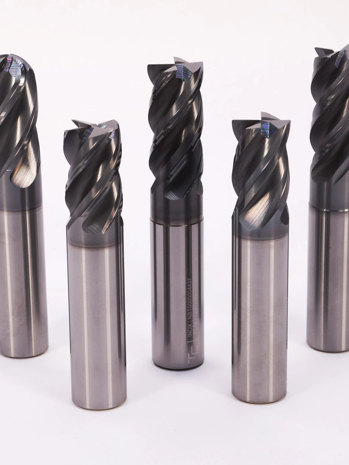
Precision Tools Industry
Services
Branding
Design
Web

Our approach
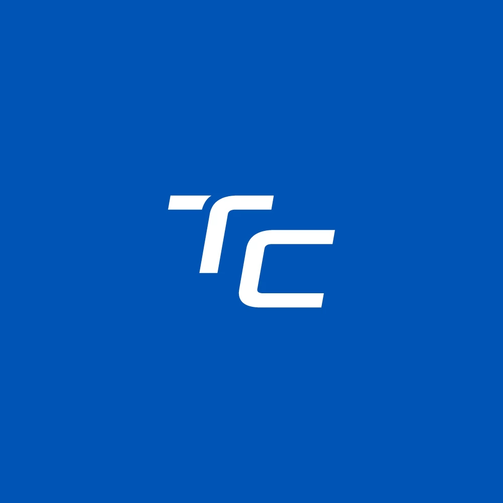
Seeking a balance between preserving the brand recognition built over more than 20 years on the market and at the same time distancing it from the parent company, Teh-Cut, we developed a modern logo that honours tradition and enhances brand recognition.
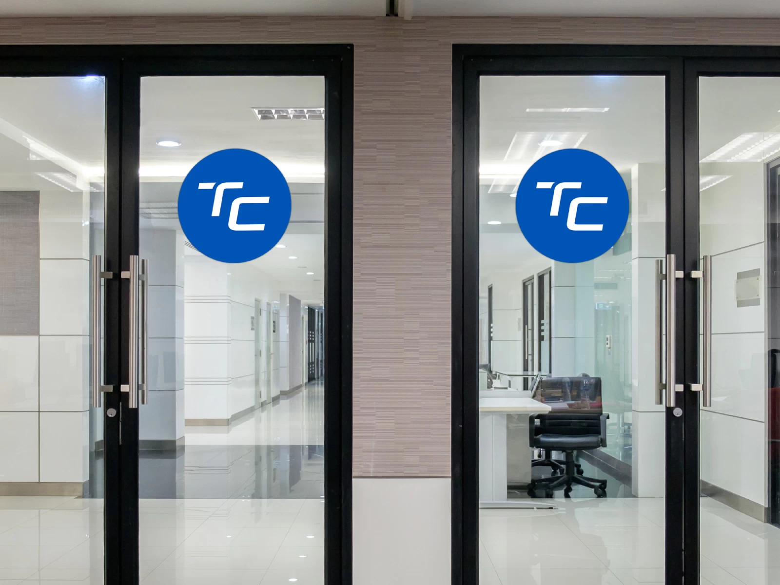
We retained the typography from the original logo because it is very powerful, communicating precision and speed, and, most importantly, it fits the industry in which the brand operates. We added a distinctive cut on the first letter "T" to create a recognisable mark for secondary uses and a smaller logo version. This cut also symbolises the craft of sharpening and precision. Additionally, we subtly incorporated a characteristic cut on the letters "OO", simplifying the symbol of the original logo that represented a milling cutter with its rotational torque. This resulted in a refined, impactful logo relevant to the industry, paying tribute to the past while looking into the future.